
Fashion and Weather dashboard

Vision
I designed a weather dashboard that recommends ideas of what to wear based on the climate. The options are open ended and the dashboards provides a classic look for day or night, and casual or elegant. I took inspiration from magazines to create a photo realistic look in my dashboard. This will help solve the problem of finding what to wear, while looking stylish, and wear in the weather
Tools: Photoshop
Role: (Solo Project) Designer, UX/UI
Objective: Create a weather dashboard pairing one element and the weather
Competitive Analysis


Firstly, I compared other dashboards to one another, looking at their pros and cons to draw inspiration for my own design. I looked at other apps that also featured weather and fashion apps.
For the first dashboard, they did a good job of visual design - adding electricity and energy to their design. The categorization also helped with organization. A con is that the numerous colors can get distracting.
The second dashboard is extremely clear and concise. The use of icons really helped. However, the lack of information is a con, and there is no visual excitement.
The third dashboard did a good job of making it unique and highly visual with just one beautiful image. A con is that all the information is hidden, and the white overlay can be distracting
Competitive Analysis on Similar Apps


I saw other apps that had the same intention of pairing fashion and weather. The first app, Oshare did a good job of condensing alot of good information into one screen. However, the anime illustrations and stylization was too child-like and gave it less credibility for a more serious audience. There were no choices on fashion - just alot of weather information
The second app, ClosetSpace, showed photos and models, so people could imagine what the outfits would look like. However, there was not alot of information about the weather (rain, etc) and all the information was hidden.
Taking that in mind, I wanted to create a dashboard that could show the important information on weather and fashion. The two apps’ information leaned more heavily on either fashion or weather, so I wanted to make mine the best of both. I also wanted to communicate a more serious tone with fashion and photography, so I made the whole dashboard on photoshop - which was good for photo editing, but unfortunately not for grids.
Sketches


Firstly, I sketched out different versions of the dashboards, including what categories — hair, makeup, day, or night that could be explored. I arrived at the conclusion that designing for fashion, with a casual or night option was best because the information does not to be crammed in. I then narrowed it down and labeled the weather as most important thus making the other information smaller.
I wanted it to be highly visual and at a glance for fashion and weather options. So, I made the other statistics (wind, cloud) smaller. I also wanted it to be a more serious, fashion-y tone, and opted for photos in my weather dashboard.
Prototyping and Iterations


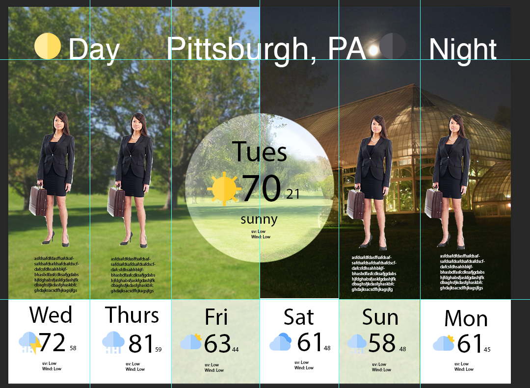
I first created ghost layouts on photoshop. I realized that if I mixed clear photos upon one another, it’ll look messy (3rd photo) so I iterated and blurred the backgrounds of the city, to bring the fashion models out. In the actual prototype, I want to cycle the clothes with arrow symbols so more fashion choices can be seen.
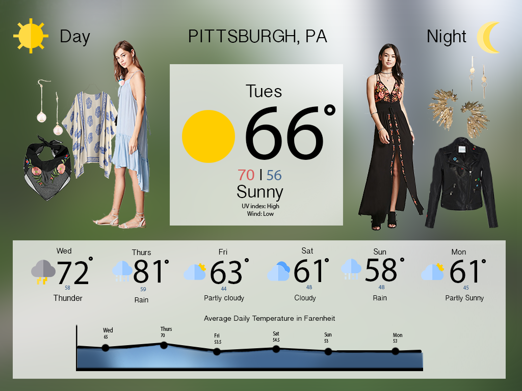
To further provide information, for the next and final iteration I added a date, time, and took out the small writing on the UV index and wind, since it might not be important.
Final Dashboards
This dashboard will tell you the temperature (high and low), rain, what to wear for day and night (the images will cycle), the scale of temperature throughout the week (the graph), the time, the date, and the city

